Branding
The Branding page makes the application look like your organisation for all of its members. Each organisation has its own theme, based on Material 3 theming.
Authorization
Open to the System Administrator and Organisation Admin roles. See Roles.
Navigation
Switch the sidebar to the Admin view, choose Settings under Organisation, then Branding in the Appearance group. See Organisation settings.
The page
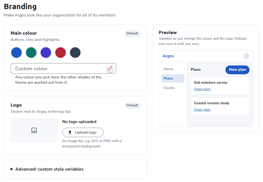
The page has three cards and a live Preview:
- Main colour: the color the theme is generated from.
- Logo: an image shown next to the product name in the top bar.
- Advanced: custom style variables: CSS variables that override the generated theme.
Each card shows whether the organisation uses its own value (Changed, with Reset to default), the Default organisation's (Set by the installation, with Use your own value), or the built-in one (Default); see How settings are saved.
The Preview updates as you change the color and the logo. Nobody else sees the changes until you save. Once saved, they apply to every member of the organisation, and the new colors apply to your own session at once.
Main colour
Pick one of the suggested colors (Blue, Teal, Indigo, Red, or Slate), type any color in Custom colour, or choose it with the color picker. The theme used for buttons, links, and highlights is generated from it.
The main color is the base from which Material generates the theme. The generated theme does not necessarily use that exact color as its primary color: the theme builder keeps the primary color as close to your choice as it can without breaking the theme's contrast rules. To use one specific color as is, set it in the custom style variables.
Logo
Upload an image, for example SVG, or PNG with a transparent background. It is shown next to the product name in the top bar. Replace or remove it at any time; a new logo reads New logo, not saved yet until you save.
Advanced: custom style variables
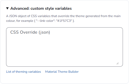
The CSS Override (json) field takes one JSON object of variable names and values, for example { "--link-color": "#1F57C3" }. The accepted variables are the Material theme variables, plus a few specific to OpenCDMP. They are applied after the theme generated from the main color, so they take precedence over it.
The card links to the List of theming variables, which is this page, and to the Material Theme Builder, which helps generate matching color values. OpenCDMP themes are generated in light mode.
Color variables
Colors use the Material --mat-sys-<token> naming convention. Commonly used color tokens:
| Name | Description |
|---|---|
--mat-sys-surface | The background color of most surfaces, such as cards and dialogs |
--mat-sys-on-surface | Icons, text, and other elements placed on a surface |
--mat-sys-background | The background of the main area, behind every element users interact with |
--mat-sys-on-background | Icons, text, and other elements placed on the background |
--mat-sys-primary | The most common color of components. Also the color associated with plans. |
--mat-sys-on-primary | Icons, text, and other elements placed on a primary background |
--mat-sys-tertiary | The accent color of components. Also the color associated with assets. |
--mat-sys-on-tertiary | Icons, text, and other elements placed on a tertiary background |
See the full list of color tokens.
Typography variables
Typography uses the --mat-sys-<scale>-<size>-<property> naming convention:
| Part | Values |
|---|---|
| scale | display, headline, title, body, label |
| size | large, medium, small |
| property | size, line-height, weight |
Where some of the sizes are used:
| Name | Used for |
|---|---|
--mat-sys-body-large-size | Editor input fields |
--mat-sys-body-medium-size | The base text size of the application |
--mat-sys-body-small-size | Hints, tooltips, the sidebar menu footer |
--mat-sys-label-large-size | Buttons |
--mat-sys-headline-large-size | Dialog and other main titles |
--mat-sys-headline-medium-size | Secondary titles |
--mat-sys-headline-small-size | Sidebar menu items, section titles |
See the full list of typography tokens.
OpenCDMP variables
Variables added by OpenCDMP, overridden the same way as the Material ones:
| Name | Default value | Description |
|---|---|---|
--link-color | #1E59B1 | The color of every link in the application |
See also
- Organisation settings - The settings hub
- Frontend configuration - Installation-wide frontend settings
- Material 3 design system - Material Design documentation